Reading other people's maps is the quickest way to learn the craft, and the quickest way to draw the wrong thing. Six industries follow. Every stage name and card quoted below is verbatim from a starter file.
Four of the six have a starter built for the job. Banking and the public sector do not, so those sections name the map to adapt and the changes it needs.
What makes an example worth copying
Three tests separate an example worth an hour from a process diagram with a face on it.
- The stages are moments, not departments. A stage called waiting for the result is something a person says. Case management is a rota.
- Each lane answers a single question. What the person did, where it happened, how it felt, what broke.
- It fits on one screen. Five to seven stages, four or five lanes. Wider than that and it stops being read.
What travels between industries is the skeleton: how many stages, which lanes, where the findings sit. A card never travels.
E-commerce: a purchase journey map example
Six stages carry a single purchase: Discover, Browse, Cart, Checkout, Delivery and Post-purchase. Under them sit Customer actions, Channels, an Emotion curve, Pains & opportunities and Metrics to watch.
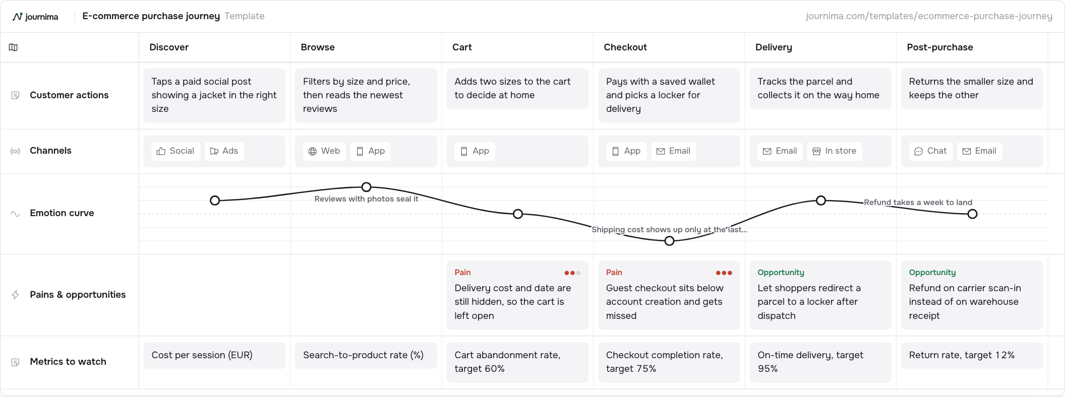
Read the top lane and the ending is already explained. At Cart the shopper "Adds two sizes to the cart to decide at home", and at Post-purchase "Returns the smaller size and keeps the other".
The curve rises to plus two at Browse, drops to zero at Cart and minus two at Checkout. The note there reads "Shipping cost shows up only at the last step". It recovers at Delivery and slides back to zero at Post-purchase, with the refund still in transit.
Two things make a shop different. The Channels lane has to leave the website: Delivery carries Email and In store, Post-purchase carries Chat and Email. And every stage holds a number somebody reads each morning, from "Cart abandonment rate, target 60%" at Cart to "Return rate, target 12%" at the end. A number beside the stage it measures is what keeps a shop map open.
Where these maps go thin is at the end. They are drawn by whoever owns the website; the warehouse, the carrier and the returns desk are not in the room. Journey mapping for e-commerce and retail has the rest.
E-commerce purchase journey template 6 stages · 5 lanes Open the template and download itB2B SaaS: mapping a buying committee
The buying committee example runs six stages: Problem recognition, Solution exploration, Requirements, Vendor selection, Negotiation and Rollout. Four lanes: Buying-committee actions, Content & channels, Pains and Metrics to watch. Journey mapping for B2B SaaS covers the renewal this map stops short of.
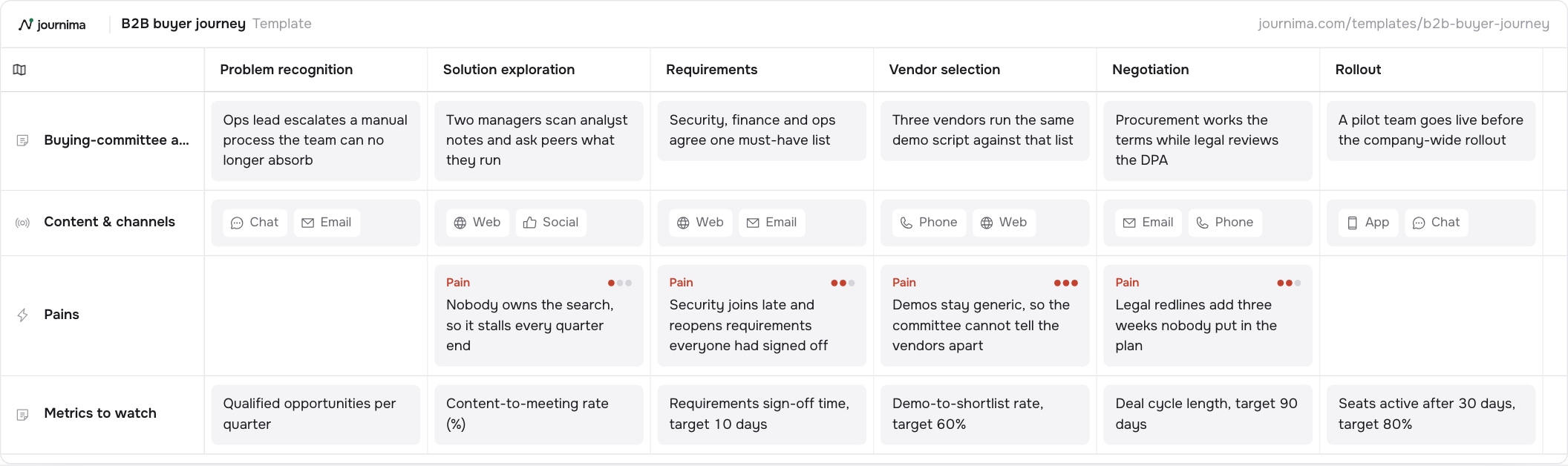
Every other example here has an emotion curve. This one does without, and a committee is why. One line would have to average the ops lead who raised the problem with legal, whose redlines add three weeks nobody planned for. Severity does that work instead: the generic demo at Vendor selection scores three, the late security review two, the stalled search one.
The actions lane is plural on purpose: "Security, finance and ops agree one must-have list" is a group act, and none of it reaches your CRM.
Each stage also holds a pipeline number. Requirements takes "Requirements sign-off time, target 10 days", Vendor selection "Demo-to-shortlist rate, target 60%", Rollout "Seats active after 30 days, target 80%". That last one matters most: Rollout is the only stage after the money, and the one nobody watches.
The failure mode here is flattery: teams map their champion and call it the committee. Security and procurement never get a card, and the pains at Requirements and Negotiation are where the weeks go. Give each role a persona. This is the journey where the usual limit of two or three is worth stretching: the traveller really is a group.
B2B buyer journey template 6 stages · 4 lanes Open the template and download itHealthcare: a patient journey map example
Six stages take one runner from a sore knee to a training plan: Symptoms, Appointment, Diagnosis, Treatment, Recovery and Aftercare. The lanes are Patient actions, Touchpoints, an Emotion curve and Pains & opportunities.
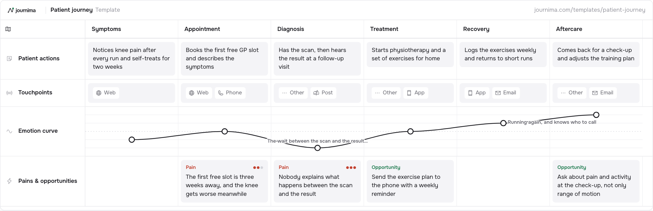
The curve opens at minus one, before anyone in the system knows this person exists, and bottoms out at minus two at Diagnosis. Nothing clinical has failed there. The scan happened. The note: "The wait between the scan and the result is the worst part".
A care map differs from a commercial one in where it happens. Three of the six stages carry the Other touchpoint and Diagnosis carries Post, because a letter and a room are not screens. Draw one from the digital channels alone and you map what was easy to instrument.
It also differs in what you can act on. The shop's two pains are both decisions somebody made. The first pain here is a three-week wait for the first free slot, which is not a design decision at all.
The risk in a clinical setting is defensiveness. A dip reads as a complaint about care, so the map gets defended rather than used. Point at where the low score sits, when nobody is treating anybody. Patient journey mapping for healthcare covers the clinic's half.
Patient journey template 6 stages · 4 lanes Open the template and download itEmployee experience: onboarding as a journey
People teams draw this one on the same grid. The onboarding starter covers Offer, First day, First week, First month and First quarter, with Employee actions, HR & manager actions, an Emotion curve and an Opportunities lane.
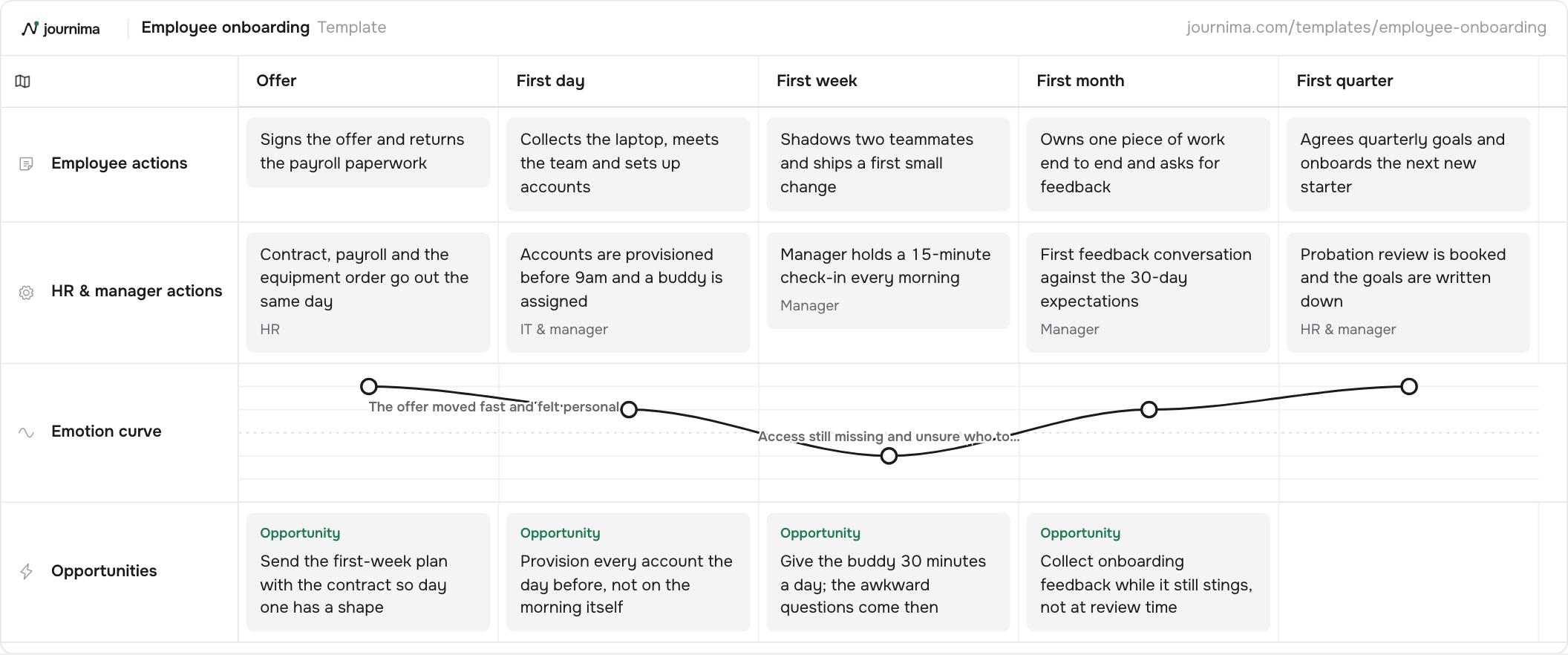
Put its curve next to the shop's. The shopper opens at plus one; the new hire at plus two, the highest first score here, because "The offer moved fast and felt personal". The fall comes in the First week: "Access still missing and unsure who to ask". A journey that starts at its peak has nothing to win, only something to protect.
The second lane is where the map earns its keep. It carries the work that makes those actions possible, and every card names a team. HR at the Offer, "IT & manager" on the first day, the manager through the first week and month.
The findings lane holds only opportunities. For a map people read about themselves that is fair, and "Provision every account the day before, not on the morning itself" says as much.
One trap: People Ops draws it alone. The lane that produces the dip belongs to IT and to one manager, and neither was asked. Employee journey mapping covers role changes and exits, which use the same columns with different words.
Employee onboarding template 5 stages · 4 lanes Open the template and download itBanking and insurance: adapting the support case
There is no claims starter, and no point pretending otherwise. The closest is the support and complaint journey, and closer than it sounds: a claim is a case. Something goes wrong, the customer reports it, somebody assesses it, money moves.
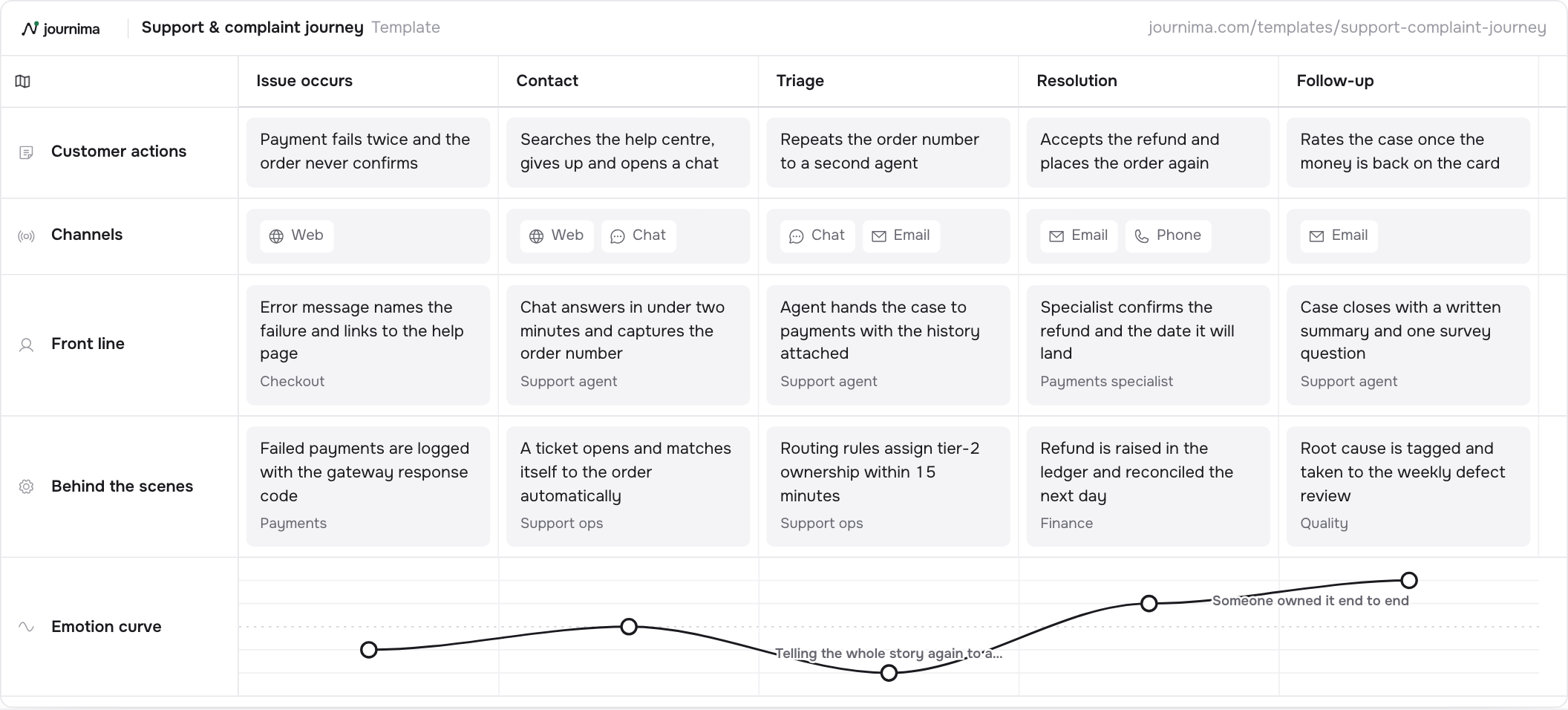
Adapt it in two moves. Rename the five stages from Issue occurs, Contact, Triage, Resolution and Follow-up to Incident, Report, Assessment, Settlement and Follow-up. Keep both service lanes, the only split of its kind here: the half a policyholder can watch, and the half they cannot. Count the days a claimant can account for; the rest are in the lower lane.
Then add the lane the starter does not have. Its five are Customer actions, Channels, Front line, Behind the scenes and Emotion curve, so a finding has nowhere to live. Add Pains & opportunities and every finding is on the map, where a claims team will actually read it. A pain card can carry a severity too. For the handful a regulator may ask about later, raise a portfolio item as well. Those carry a key, a score and their evidence across every map in the workspace.
Keep the curve as it is. The care example dips on a wait; this one dips on a handover. Both are shapes a service makes by itself. Here it is Triage, at minus two, where the card reads "Repeats the order number to a second agent". A claim passed to a second assessor costs the same. Journey mapping for banking and insurance covers the paper trail.
Public sector: adapting the day in the life
Nothing here fits neatly either. A permit renewal or a benefits claim crosses departments, the subject of service journey mapping for the public sector. The wait that annoys the resident sits in a queue they cannot see. The closest starter is the day in the life map, and not as a consolation.
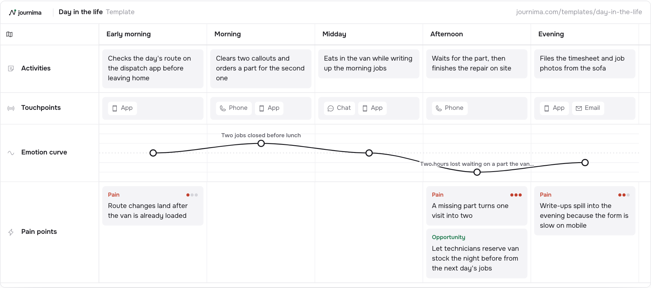
A resident is not shopping, and is rarely at a desk when your letter lands. Shadow one, and let the day say which moment your service occupies. The five slices are Early morning, Morning, Midday, Afternoon and Evening, over Activities, Touchpoints, an Emotion curve and Pain points. Its worst score is nothing anybody designed: the Afternoon pain card reads "A missing part turns one visit into two". A form that will not submit from a phone has the same shape.
Two changes. Swap the technician's Activities for the resident's day around your service, keeping the slices: the hour a thing happens is half the finding. Then rename Pain points to Pains & opportunities: the lane already carries one opportunity card at Afternoon.
Once a slice tells you which moment hurts, it deserves its own map. When the cause is a check sitting in another department's queue, the tool is a service blueprint. The guide to creating one has the method, and the starter has its four lanes ready.
Turning an example into your own map
Here is the whole set. Take the one whose shape fits your problem, not the one whose industry matches your job title. A shop mapping returns learns more from the support case.
Then work in this order. Rename the stages in your customer's words. Fill the actions lane across before opening a second. Score the curve, annotate where it turns, and stop. The long version is the step-by-step guide to making a map.
All nine starters sit on the templates page, with their stages, lanes and example cards. Each downloads as a spreadsheet, no account needed, so you can fill one in before choosing software.